
Complext Data-table design
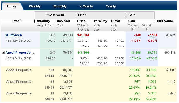
In this table structure, data is stacked. Even without grid structure design, data is not clustered. By having first look, the data looks confusing. With in seconds its very simple in mapping with the label and the data. Look at the screenshot below, mapping is done a nicer way. Label "Quantity" is bold, even the quantity in numbers is maintained bold. High & Low attributes under the label "Intra day" is stacked and this is also very easy while reading. This screenshot is from one of the stock exchange website. This forms look simple to design, but its not.

3 comments:
This design is not clear at all.
I wish you run spell check before you publish your blog post.
It's not that great but no bad either
Post a Comment